# Badge
信息标记组件,可以附加在单个组件上用于信息提醒的容器组件。
> **说明:**
>
> 该组件从API Version 7开始支持。后续版本如有新增内容,则采用上角标单独标记该内容的起始版本。
## 子组件
支持单个子组件。
> **说明:**
>
> 子组件类型:系统组件和自定义组件,支持渲染控制类型([if/else](../../../quick-start/arkts-rendering-control-ifelse.md)、[ForEach](../../../quick-start/arkts-rendering-control-foreach.md)和[LazyForEach](../../../quick-start/arkts-rendering-control-lazyforeach.md))。
## 接口
### Badge
Badge(value: BadgeParamWithNumber)
根据数字创建标记组件。
**卡片能力:** 从API version 9开始,该接口支持在ArkTS卡片中使用。
**原子化服务API:** 从API version 11开始,该接口支持在原子化服务中使用。
**系统能力:** SystemCapability.ArkUI.ArkUI.Full
**参数:**
| 参数名 | 类型 | 必填 | 说明 |
| -------- | -------- | -------- | -------- |
| value | [BadgeParamWithNumber](#badgeparamwithnumber对象说明)| 是 | 数字标记组件参数。|
### Badge
Badge(value: BadgeParamWithString)
根据字符串创建标记组件。
**卡片能力:** 从API version 9开始,该接口支持在ArkTS卡片中使用。
**原子化服务API:** 从API version 11开始,该接口支持在原子化服务中使用。
**系统能力:** SystemCapability.ArkUI.ArkUI.Full
从API version 12开始,该组件显隐时支持scale动效。
**参数:**
| 参数名 | 类型 | 必填 | 说明 |
| ------ | ----------------------------------------------------- | ---- | -------------------- |
| value | [BadgeParamWithString](#badgeparamwithstring对象说明) | 是 | 字符串标记组件参数。 |
## BadgeParam对象说明
包含创建Badge组件的基础参数。
**卡片能力:** 从API version 9开始,该接口支持在ArkTS卡片中使用。
**原子化服务API:** 从API version 11开始,该接口支持在原子化服务中使用。
**系统能力:** SystemCapability.ArkUI.ArkUI.Full
| 名称 | 类型 | 必填 | 说明 |
| -------- | -------- | -------- | -------- |
| position | [BadgePosition](#badgeposition枚举说明)\|[Position10+](ts-types.md#position) | 否| 设置提示点显示位置。
默认值:BadgePosition.RightTop
**说明:**
Position作为入参,不支持设置百分比;设置为非法值时,默认(0,0)处理。(0,0)为组件左上角位置。
BadgePosition作为入参时,会跟随[Direction](ts-appendix-enums.md#direction)属性控制镜像显示。|
| style | [BadgeStyle](#badgestyle对象说明) | 是 | Badge组件可设置样式,支持设置文本颜色、尺寸、圆点颜色和尺寸。 |
## BadgeParamWithNumber对象说明
BadgeParamWithNumber继承自[BadgeParam](#badgeparam对象说明),具有BadgeParam的全部属性。
**卡片能力:** 从API version 9开始,该接口支持在ArkTS卡片中使用。
**原子化服务API:** 从API version 11开始,该接口支持在原子化服务中使用。
**系统能力:** SystemCapability.ArkUI.ArkUI.Full
| 名称 | 类型 | 必填 | 说明 |
| -------- | -------- | -------- | -------- |
| count | number | 是 | 设置提醒消息数。
**说明:**
小于等于0且小于maxCount时不显示信息标记。
取值范围:[-2147483648,2147483647],超出范围时会加上或减去4294967296,使得值仍在范围内,非整数时会舍去小数部分取整数部分,如5.5取5。 |
| maxCount | number | 否 | 最大消息数,超过最大消息时仅显示maxCount+。
默认值:99
取值范围:[-2147483648,2147483647],超出范围时会加上或减去4294967296,使得值仍在范围内,非整数时会舍去小数部分取整数部分,如5.5取5。 |
## BadgeParamWithString对象说明
BadgeParamWithString继承自[BadgeParam](#badgeparam对象说明),具有BadgeParam的全部属性。
**卡片能力:** 从API version 9开始,该接口支持在ArkTS卡片中使用。
**原子化服务API:** 从API version 11开始,该接口支持在原子化服务中使用。
**系统能力:** SystemCapability.ArkUI.ArkUI.Full
| 名称 | 类型 | 必填 | 说明 |
| -------- | -------- | -------- | -------- |
| value | string | 是 | 提示内容的文本字符串。 |
## BadgePosition枚举说明
**卡片能力:** 从API version 9开始,该接口支持在ArkTS卡片中使用。
**原子化服务API:** 从API version 11开始,该接口支持在原子化服务中使用。
**系统能力:** SystemCapability.ArkUI.ArkUI.Full
| 名称 | 值 | 说明 |
| -------- | -------- |-------- |
| RightTop | 0 | 圆点显示在右上角。 |
| Right | 1 | 圆点显示在右侧纵向居中。 |
| Left | 2 | 圆点显示在左侧纵向居中。 |
## BadgeStyle对象说明
**原子化服务API:** 从API version 11开始,该接口支持在原子化服务中使用。
**系统能力:** SystemCapability.ArkUI.ArkUI.Full
| 名称 | 类型 | 必填 | 说明 |
| ------------------------- | ------------------------------------------------------------ | ---- | ------------------------------------------------------------ |
| color | [ResourceColor](ts-types.md#resourcecolor) | 否 | 文本颜色。
默认值:Color.White
**卡片能力:** 从API version 9开始,该接口支持在ArkTS卡片中使用。 |
| fontSize | number \| string | 否 | 文本大小。
默认值:10
单位:fp
**说明:**
不支持设置百分比。
**卡片能力:** 从API version 9开始,该接口支持在ArkTS卡片中使用。 |
| badgeSize | number \| string | 否 | Badge的大小。
默认值:16
单位:vp
**说明:**
不支持设置百分比。当设置为非法值时,按照默认值处理。
**卡片能力:** 从API version 9开始,该接口支持在ArkTS卡片中使用。 |
| badgeColor | [ResourceColor](ts-types.md#resourcecolor) | 否 | Badge的颜色。
默认值:Color.Red
**卡片能力:** 从API version 9开始,该接口支持在ArkTS卡片中使用。 |
| fontWeight10+ | number \|[FontWeight](ts-appendix-enums.md#fontweight) \| string | 否 | 设置文本的字体粗细。
默认值:FontWeight.Normal
**说明:**
不支持设置百分比。 |
| borderColor10+ | [ResourceColor](ts-types.md#resourcecolor) | 否 | 底板描边颜色。
默认值:Color.Red |
| borderWidth10+ | [Length](ts-types.md#length) | 否 | 底板描边粗细。
默认值:1
单位:vp
**说明:**
不支持设置百分比。 |
## 属性
支持[通用属性](ts-universal-attributes-size.md)。
## 事件
支持[通用事件](ts-universal-events-click.md)。
## 示例
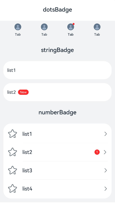
### 示例1(设置标记组件内容)
该示例通过value和count属性,实现了传入空值、字符、数字时标记组件展现不同的效果。
```ts
// xxx.ets
@Entry
@Component
struct BadgeExample {
@Builder
tabBuilder(index: number) {
Column() {
if (index === 2) {
Badge({
value: '',
style: { badgeSize: 6, badgeColor: '#FA2A2D' }
}) {
Image('/common/public_icon_off.svg')
.width(24)
.height(24)
}
.width(24)
.height(24)
.margin({ bottom: 4 })
} else {
Image('/common/public_icon_off.svg')
.width(24)
.height(24)
.margin({ bottom: 4 })
}
Text('Tab')
.fontColor('#182431')
.fontSize(10)
.fontWeight(500)
.lineHeight(14)
}.width('100%').height('100%').justifyContent(FlexAlign.Center)
}
@Builder
itemBuilder(value: string) {
Row() {
Image('common/public_icon.svg').width(32).height(32).opacity(0.6)
Text(value)
.width(177)
.height(21)
.margin({ left: 15, right: 76 })
.textAlign(TextAlign.Start)
.fontColor('#182431')
.fontWeight(500)
.fontSize(16)
.opacity(0.9)
Image('common/public_icon_arrow_right.svg').width(12).height(24).opacity(0.6)
}.width('100%').padding({ left: 12, right: 12 }).height(56)
}
build() {
Column() {
// 红点类型的标记组件
Text('dotsBadge').fontSize(18).fontColor('#182431').fontWeight(500).margin(24)
Tabs() {
TabContent()
.tabBar(this.tabBuilder(0))
TabContent()
.tabBar(this.tabBuilder(1))
TabContent()
.tabBar(this.tabBuilder(2))
TabContent()
.tabBar(this.tabBuilder(3))
}
.width(360)
.height(56)
.backgroundColor('#F1F3F5')
// 根据字符创建的标记组件
Column() {
Text('stringBadge').fontSize(18).fontColor('#182431').fontWeight(500).margin(24)
List({ space: 12 }) {
ListItem() {
Text('list1').fontSize(14).fontColor('#182431').margin({ left: 12 })
}
.width('100%')
.height(56)
.backgroundColor('#FFFFFF')
.borderRadius(24)
.align(Alignment.Start)
ListItem() {
Badge({
value: 'New',
position: BadgePosition.Right,
style: { badgeSize: 16, badgeColor: '#FA2A2D' }
}) {
Text('list2').width(27).height(19).fontSize(14).fontColor('#182431')
}.width(49.5).height(19)
.margin({ left: 12 })
}
.width('100%')
.height(56)
.backgroundColor('#FFFFFF')
.borderRadius(24)
.align(Alignment.Start)
}.width(336)
// 根据数字创建的标记组件
Text('numberBadge').fontSize(18).fontColor('#182431').fontWeight(500).margin(24)
List() {
ListItem() {
this.itemBuilder('list1')
}
ListItem() {
Row() {
Image('common/public_icon.svg').width(32).height(32).opacity(0.6)
Badge({
count: 1,
position: BadgePosition.Right,
style: { badgeSize: 16, badgeColor: '#FA2A2D' }
}) {
Text('list2')
.width(177)
.height(21)
.textAlign(TextAlign.Start)
.fontColor('#182431')
.fontWeight(500)
.fontSize(16)
.opacity(0.9)
}.width(240).height(21).margin({ left: 15, right: 11 })
Image('common/public_icon_arrow_right.svg').width(12).height(24).opacity(0.6)
}.width('100%').padding({ left: 12, right: 12 }).height(56)
}
ListItem() {
this.itemBuilder('list3')
}
ListItem() {
this.itemBuilder('list4')
}
}
.width(336)
.height(232)
.backgroundColor('#FFFFFF')
.borderRadius(24)
.padding({ top: 4, bottom: 4 })
.divider({
strokeWidth: 0.5,
color: 'rgba(0,0,0,0.1)',
startMargin: 60,
endMargin: 12
})
}.width('100%').backgroundColor('#F1F3F5').padding({ bottom: 12 })
}.width('100%')
}
}
```
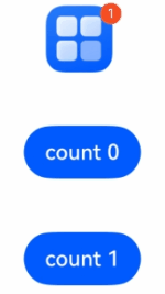
### 示例2(设置数字控制标记显隐)
该示例通过count属性,实现了设置数字0和1时标记组件的隐藏和显示效果。
```ts
// 该示例实现了Badge组件显隐时缩放
@Entry
@Component
struct Index {
@State badgeCount: number = 1
build() {
Column({ space: 40 }) {
Badge({
count: this.badgeCount,
style: {},
position: BadgePosition.RightTop,
}) {
Image($r("app.media.startIcon"))
.width(50)
.height(50)
}
.width(55)
Button('count 0').onClick(() => {
this.badgeCount = 0
})
Button('count 1').onClick(() => {
this.badgeCount = 1
})
}
.margin({ top: 20 })
}
}
```