# Outline
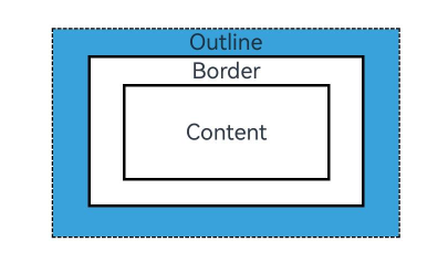
You can set outline attributes for components. Drawn outside the component, the outline does not affect the component's layout or increases its size.
> **NOTE**
>
> This feature is supported since API version 11. Updates will be marked with a superscript to indicate their earliest API version.
## outline
outline(value: OutlineOptions)
Sets the outline attributes in one declaration.
**Widget capability**: This API can be used in ArkTS widgets since API version 11.
**Atomic service API**: This API can be used in atomic services since API version 12.
**System capability**: SystemCapability.ArkUI.ArkUI.Full
**Parameters**
| Name| Type | Mandatory| Description|
| ------ | ----------------------------------------- | ---- | ---- |
| value | [OutlineOptions](#outlineoptions) | Yes | Outline attributes. |
## OutlineStyle11+
**Widget capability**: This API can be used in ArkTS widgets since API version 11.
**Atomic service API**: This API can be used in atomic services since API version 12.
**System capability**: SystemCapability.ArkUI.ArkUI.Full
| Name | Description |
| ------ | ----------------------------- |
| SOLID | Solid border. |
| DASHED | Dashed border. |
| DOTTED | Dotted border. The radius of a dot is half of **outlineWidth**.|
## outlineStyle
outlineStyle(value: OutlineStyle | EdgeOutlineStyles)
Sets the style of the outline.
**Widget capability**: This API can be used in ArkTS widgets since API version 11.
**Atomic service API**: This API can be used in atomic services since API version 12.
**System capability**: SystemCapability.ArkUI.ArkUI.Full
**Parameters**
| Name| Type | Mandatory| Description |
| ------ | ------------------------------------------------------------ | ---- | ----------------------------------------------------- |
| value | [OutlineStyle](#outlinestyle11) \| [EdgeOutlineStyles](#edgeoutlinestyles) | Yes | Outline style.
Default value: **OutlineStyle.SOLID**|
## outlineWidth
outlineWidth(value: Dimension | EdgeOutlineWidths)
Sets the thickness of the outline.
**Widget capability**: This API can be used in ArkTS widgets since API version 11.
**Atomic service API**: This API can be used in atomic services since API version 12.
**System capability**: SystemCapability.ArkUI.ArkUI.Full
**Parameters**
| Name| Type | Mandatory| Description |
| ------ | ------------------------------------------------------------ | ---- | ------------------------------------------------------------ |
| value | [Dimension](ts-types.md#dimension10) \| [EdgeOutlineWidths](#edgeoutlinewidths) | Yes | Outline thickness. This parameter cannot be set in percentage.
Default value: **0**.|
## outlineColor
outlineColor(value: ResourceColor | EdgeColors)
Sets the color of the outline.
**Widget capability**: This API can be used in ArkTS widgets since API version 11.
**Atomic service API**: This API can be used in atomic services since API version 12.
**System capability**: SystemCapability.ArkUI.ArkUI.Full
**Parameters**
| Name| Type | Mandatory| Description |
| ------ | ------------------------------------------------------------ | ---- | ------------------------------------------------ |
| value | [ResourceColor](ts-types.md#resourcecolor) \| [EdgeColors](#edgecolors) | Yes | Outline color.
Default value: **Color.Black**|
## outlineRadius
outlineRadius(value: Dimension | OutlineRadiuses)
Sets the radius of the outline corners.
**Widget capability**: This API can be used in ArkTS widgets since API version 11.
**Atomic service API**: This API can be used in atomic services since API version 12.
**System capability**: SystemCapability.ArkUI.ArkUI.Full
**Parameters**
| Name| Type | Mandatory| Description |
| ------ | ------------------------------------------------------------ | ---- | ------------------------------------------------------------ |
| value | [Dimension](ts-types.md#dimension10) \| [OutlineRadiuses](#outlineradiuses) | Yes | Radius of the outline corners. This parameter cannot be set in percentage.
Default value: **0**
Maximum effective value: Component width/2 + outlineWidth or component height/2 + outlineWidth|
## OutlineOptions
**Atomic service API**: This API can be used in atomic services since API version 12.
**Widget capability**: This API can be used in ArkTS widgets since API version 12.
| Name | Type |Mandatory | Description |
| ------ | ----------------------|-------------------------------------- | ------------------------------------------------------------ |
| width | [Dimension](ts-types.md#dimension10) \| [EdgeOutlineWidths](#edgeoutlinewidths) | No| Outline thickness. This parameter cannot be set in percentage.
Default value: **0**|
| color | [ResourceColor](ts-types.md#resourcecolor) \| [EdgeColors](#edgecolors) \| [LocalizedEdgeColors](#localizededgecolors12)12+ |No| Outline color.
Default value: **Color.Black** |
| radius | [Dimension](ts-types.md#dimension10) \| [OutlineRadiuses](#outlineradiuses) | No| Radius of the outline corners. This parameter cannot be set in percentage.
Default value: **0**
Maximum effective value: Component width/2 + outlineWidth or component height/2 + outlineWidth|
| style | [OutlineStyle](#outlinestyle11) \| [EdgeOutlineStyles](#edgeoutlinestyles) |No| Outline style.
Default value: **OutlineStyle.SOLID** |
## EdgeOutlineWidths
To reference this object, at least one parameter must be passed.
**Atomic service API**: This API can be used in atomic services since API version 12.
**Widget capability**: This API can be used in ArkTS widgets since API version 12.
| Name | Type | Mandatory | Description |
| ------ | ---------------------------- | ---- | ------- |
| left | [Dimension](ts-types.md#dimension10) | No | Thickness of the left outline.|
| right | [Dimension](ts-types.md#dimension10) | No | Thickness of the right outline.|
| top | [Dimension](ts-types.md#dimension10) | No | Thickness of the top outline.|
| bottom | [Dimension](ts-types.md#dimension10) | No | Thickness of the bottom outline.|
## EdgeColors
To reference this object, at least one parameter must be passed.
**Atomic service API**: This API can be used in atomic services since API version 11.
**System capability**: SystemCapability.ArkUI.ArkUI.Full
**Widget capability**: This API can be used in ArkTS widgets since API version 12.
| Name | Type | Mandatory | Description |
| ------ | ---------------------------------------- | ---- | ------- |
| left | [ResourceColor](ts-types.md#resourcecolor) | No | Color of the left outline.|
| right | [ResourceColor](ts-types.md#resourcecolor) | No | Color of the right outline.|
| top | [ResourceColor](ts-types.md#resourcecolor) | No | Color of the top outline.|
| bottom | [ResourceColor](ts-types.md#resourcecolor) | No | Color of the bottom outline.|
## LocalizedEdgeColors12+
To reference this object, at least one parameter must be passed.
**Atomic service API**: This API can be used in atomic services since API version 12.
**Widget capability**: This API can be used in ArkTS widgets since API version 12.
| Name | Type | Mandatory | Description |
| ------ | ---------------------------------------- | ---- | ------- |
| start | [ResourceColor](ts-types.md#resourcecolor) | No | Color of the left outline.
For right-to-left scripts, this indicates the color of the right outline.|
| end | [ResourceColor](ts-types.md#resourcecolor) | No | Color of the right outline.
For right-to-left scripts, this indicates the color of the left outline.|
| top | [ResourceColor](ts-types.md#resourcecolor) | No | Color of the top outline.|
| bottom | [ResourceColor](ts-types.md#resourcecolor) | No | Color of the bottom outline.|
## OutlineRadiuses
To reference this object, at least one parameter must be passed.
**Atomic service API**: This API can be used in atomic services since API version 12.
**Widget capability**: This API can be used in ArkTS widgets since API version 12.
| Name | Type | Mandatory | Description |
| ----------- | ---------------------------- | ---- | -------- |
| topLeft | [Dimension](ts-types.md#dimension10) | No | Radius of the upper-left corner.|
| topRight | [Dimension](ts-types.md#dimension10) | No | Radius of the upper-right corner.|
| bottomLeft | [Dimension](ts-types.md#dimension10) | No | Radius of the lower-left corner.|
| bottomRight | [Dimension](ts-types.md#dimension10) | No | Radius of the lower-right corner.|
## EdgeOutlineStyles
To reference this object, at least one parameter must be passed.
**Atomic service API**: This API can be used in atomic services since API version 12.
**Widget capability**: This API can be used in ArkTS widgets since API version 12.
| Name | Type | Mandatory | Description |
| ------ | ---------------------------------------- | ---- | ------- |
| left | [OutlineStyle](#outlinestyle11) | No | Style of the left outline.|
| right | [OutlineStyle](#outlinestyle11) | No | Style of the right outline.|
| top | [OutlineStyle](#outlinestyle11) | No | Style of the top outline.|
| bottom | [OutlineStyle](#outlinestyle11) | No | Style of the bottom outline.|
## Example
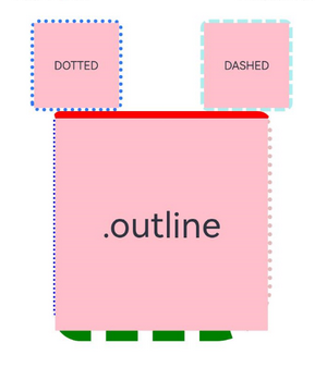
### Example 1: Using Outline Attributes
This example demonstrates how to implement component outlines using the outline attributes.
```ts
// xxx.ets
@Entry
@Component
struct OutlineExample {
build() {
Column() {
Flex({ justifyContent: FlexAlign.SpaceAround, alignItems: ItemAlign.Center }) {
// Dashed line
Text('DASHED')
.backgroundColor(Color.Pink)
.outlineStyle(OutlineStyle.DASHED).outlineWidth(5).outlineColor(0xAFEEEE).outlineRadius(10)
.width(120).height(120).textAlign(TextAlign.Center).fontSize(16)
// Dotted line
Text('DOTTED')
.backgroundColor(Color.Pink)
.outline({ width: 5, color: 0x317AF7, radius: 10, style: OutlineStyle.DOTTED })
.width(120).height(120).textAlign(TextAlign.Center).fontSize(16)
}.width('100%').height(150)
Text('.outline')
.backgroundColor(Color.Pink)
.fontSize(50)
.width(300)
.height(300)
.outline({
width: { left: 3, right: 6, top: 10, bottom: 15 },
color: { left: '#e3bbbb', right: Color.Blue, top: Color.Red, bottom: Color.Green },
radius: { topLeft: 10, topRight: 20, bottomLeft: 40, bottomRight: 80 },
style: {
left: OutlineStyle.DOTTED,
right: OutlineStyle.DOTTED,
top: OutlineStyle.SOLID,
bottom: OutlineStyle.DASHED
}
}).textAlign(TextAlign.Center)
}
}
}
```

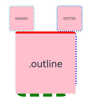
### Example 2: Using the LocalizedEdgeColors Type
This example sets the **color** property of the **outline** attribute to the LocalizedEdgeColors type.
```ts
// xxx.ets
@Entry
@Component
struct OutlineExample {
build() {
Column() {
Flex({ justifyContent: FlexAlign.SpaceAround, alignItems: ItemAlign.Center }) {
// Dashed line
Text('DASHED')
.backgroundColor(Color.Pink)
.outlineStyle(OutlineStyle.DASHED).outlineWidth(5).outlineColor(0xAFEEEE).outlineRadius(10)
.width(120).height(120).textAlign(TextAlign.Center).fontSize(16)
// Dotted line
Text('DOTTED')
.backgroundColor(Color.Pink)
.outline({ width: 5, color: 0x317AF7, radius: 10, style: OutlineStyle.DOTTED })
.width(120).height(120).textAlign(TextAlign.Center).fontSize(16)
}.width('100%').height(150)
Text('.outline')
.backgroundColor(Color.Pink)
.fontSize(50)
.width(300)
.height(300)
.outline({
width: { left: 3, right: 6, top: 10, bottom: 15 },
color: { start: '#e3bbbb', end: Color.Blue, top: Color.Red, bottom: Color.Green },
radius: { topLeft: 10, topRight: 20, bottomLeft: 40, bottomRight: 80 },
style: {
left: OutlineStyle.DOTTED,
right: OutlineStyle.DOTTED,
top: OutlineStyle.SOLID,
bottom: OutlineStyle.DASHED
}
}).textAlign(TextAlign.Center)
}
}
}
```
The following shows how the example is represented with left-to-right scripts.
The following shows how the example is represented with right-to-left scripts.