# Stack
The **Stack** component provides a stack container where child components are successively stacked and the latter one overwrites the previous one.
> **NOTE**
>
> This component is supported since API version 7. Updates will be marked with a superscript to indicate their earliest API version.
## Child Components
This component can contain child components.
## APIs
Stack(value?: { alignContent?: Alignment })
**Widget capability**: This API can be used in ArkTS widgets since API version 9.
**Atomic service API**: This API can be used in atomic services since API version 11.
**System capability**: SystemCapability.ArkUI.ArkUI.Full
**Parameters**
| Name | Type | Mandatory| Description |
| ------------ | ------------------------------------------- | ---- | ----------------------------------------------------------- |
| alignContent | [Alignment](ts-appendix-enums.md#alignment) | No | Alignment of child components in the container.
Default value: **Alignment.Center**|
## Attributes
In addition to the [universal attributes](ts-universal-attributes-size.md), the following attributes are supported.
### alignContent
alignContent(value: Alignment)
Sets the alignment of all child components in the container. When both this attribute and the universal attribute [align](ts-universal-attributes-location.md#align) are set, whichever is set last takes effect.
**Atomic service API**: This API can be used in atomic services since API version 11.
**Widget capability**: This API can be used in ArkTS widgets since API version 9.
**System capability**: SystemCapability.ArkUI.ArkUI.Full
**Parameters**
| Name| Type | Mandatory| Description |
| ------ | ------------------------------------------- | ---- | ----------------------------------------------------------- |
| value | [Alignment](ts-appendix-enums.md#alignment) | Yes | Alignment of all child components in the container.
Default value: **Alignment.Center**|
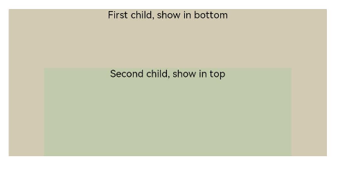
## Example
```ts
// xxx.ets
@Entry
@Component
struct StackExample {
build() {
Stack({ alignContent: Alignment.Bottom }) {
Text('First child, show in bottom').width('90%').height('100%').backgroundColor(0xd2cab3).align(Alignment.Top)
Text('Second child, show in top').width('70%').height('60%').backgroundColor(0xc1cbac).align(Alignment.Top)
}.width('100%').height(150).margin({ top: 5 })
}
}
```